
The Market Has Two Personalities
Every day the S&P 500 moves. Up a little. Down a little. Occasionally, a lot.

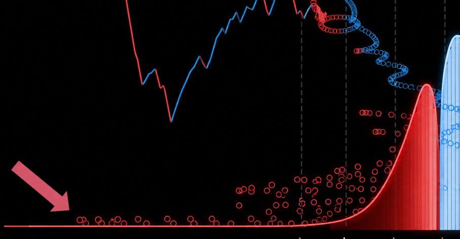
We’ve been staring at price charts for decades, but a price chart is a terrible way to understand risk. It shows you the path, not the probability. It hides the shape of what the market actually does.
This animation tries to fix that.
What You’re Watching
The top half is the S&P 500 price history, starting in 1950. A rolling five-year window scrolls forward in time, so you’re always watching the most recent chapter unfold.
Every single day, as the price moves, a particle is released. That particle carries the log return of that day — how much the index moved, as a percentage — and it falls to the bottom of the screen.
Over time, thousands of particles land and stack up. They build two mountains.
Blue particles are calm-regime days: the market was rising. They land to the right of center — positive returns.
Red particles are panic-regime days: the market was falling. They land to the left — negative returns.
The result is a live distribution of returns, assembling itself in real time from 75 years of market history.
What the Shape Is Telling You
When the animation settles, a few things stand out:
The blue mountain is taller and sits to the right. Most days, the market drifts upward. The average daily return on the S&P 500 since 1950 is positive — roughly +0.04% per day, or about +10% annualized. This is the equity risk premium doing its job: rewarding patience with a slow, persistent upward bias.
The red mountain has a fatter left tail. Drawdown days are not simply the mirror image of up days. When the market falls, it tends to fall harder and faster than it rises. Crashes cluster. Panics compound. The distribution of losses extends well past −2σ and −3σ in ways the gains side does not.
Both mountains are narrow — and that’s the trap. The bulk of returns, calm and panic alike, sit close to zero. This is why daily volatility feels manageable. But the tails are heavier than a normal distribution would predict. The rare −4σ or −5σ day is not a once-in-a-century statistical curiosity. It happens. It happened in 1987, in 2008, in March 2020. The animation marks each of these with a red glow.
The Empirical Summary
After 75 years of daily data, here is what the shape says:
Positive returns are more frequent. The market goes up more days than it goes down — roughly 54% of trading days.
Positive returns are smaller on average. Up days tend to be modest. Down days tend to be sharper.
The loss distribution has fat tails. Extreme negative outcomes occur far more often than a Gaussian bell curve would assign them probability.
The two regimes are real and distinct. Calm and panic are not just labels — they generate genuinely different return profiles, which is why simply averaging them into a single distribution misses the structure.
The market, in other words, is generous most of the time and occasionally brutal. That asymmetry is not a bug. It is the entire reason the equity premium exists: you are being paid to absorb those fat left tails that everyone else is afraid of.
Data: S&P 500 daily closing prices, 1950–2025, Yahoo Finance. Returns are log returns. Regime classification based on price direction (rising = calm, falling = panic). KDE estimated with Scott’s rule.