
How do stock prices actually emerge?
Who decides the price of a stock?

There is no committee, no algorithm with a mandate, no single participant with that authority. And yet every millisecond, across every exchange in the world, a price exists — precise to the penny, continuously updated, instantly agreed upon by millions of participants who have never spoken to each other.
How does that happen?
What You’re Watching
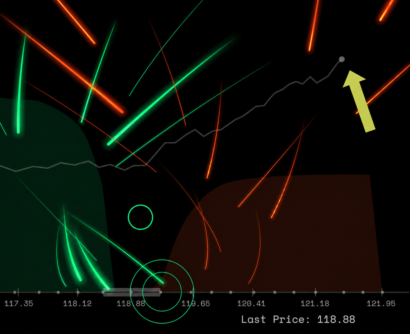
The animation shows a simplified but mechanically accurate model of a continuous double auction — the engine that runs every major stock and futures exchange on earth.
At the top are 8 nodes representing stock exchanges, from which buy and sell orders are sent through. Each one represents a participant with an opinion and capital: a hedge fund, a market maker, a pension fund, an algorithmic trader. They are constantly submitting orders.
Two types of orders flow down from the stock exchanges:
Green lines — Bids. Limit buy orders. A participant is saying: I will buy X shares at this price, no higher. The order travels down and settles into the left side of the order book, waiting.
Red lines — Offers. Limit sell orders. A participant is saying: I will sell X shares at this price, no lower. These settle into the right side of the book.
The order book — that dense spine of green and red bars at the bottom — is nothing more than the current accumulation of all unfilled limit orders, sorted by price. The taller the bar at a given price, the more shares are sitting there, willing to trade.
Circles — Market orders. When someone needs to transact now — no price condition, just execute — they send a market order. A green circle means a market buy: it sweeps through the ask side, lifting whatever offers are sitting there at the lowest prices. A red circle means a market sell: it hits the bids, taking the best available prices on the buy side.
The moment a market order meets a limit order, a trade happens. The last traded price becomes the price.
The Circuit
Notice that the price chart running behind the scene doesn’t come from a feed. It emerges from the orders themselves.
When market buys are heavy — when participants are more urgently willing to pay than sellers are willing to wait — the ask side of the book gets consumed faster than it’s replenished. The best ask climbs. Price rises.
When market sells dominate — when holders want out faster than buyers are stepping up — the bid side erodes. The best bid falls. Price drops.
The spread — the gap between the best bid and best ask — is a live signal of how contested the market is right now. In liquid, calm conditions it narrows to almost nothing. When uncertainty spikes and market makers pull their quotes, it widens. You can see this in the animation: the spine breathes as conditions change.
Price is the output of a circuit, not an input. Orders flow in, collide, clear. What remains — the last price traded — is simply the evidence of the most recent agreement.
What This Means in Practice
Understanding this circuit has a few non-obvious implications:
Liquidity is fragile and asymmetric. The order book can look healthy — deep on both sides — and then evaporate in seconds. Limit orders are cancellable. When volatility spikes, market makers widen spreads or pull out entirely, and a book that looked thick can suddenly be thin. The “price” you see on a screen assumes someone is willing to take the other side of your trade. That assumption is not always valid.
Market orders are expensive. Sending a market order means you are the impatient participant. You get certainty of execution but you pay the spread and, for large orders, you push the price against yourself. Professional traders obsess over this “market impact” because it’s a direct cost that never appears in your trade confirmation.
The price chart is a compression artifact. What you see on a typical price chart — open, high, low, close — is the end result of thousands of these micro-collisions compressed into a single bar. Two days with identical OHLC numbers could have had completely different order flow dynamics. The chart tells you where price ended up, not how it got there or why.
The order flow model shown here uses a simulated continuous double auction with 8 stock exchanges participants, stochastic limit and market order arrivals, and a dynamic spread calibrated to order imbalance. No real market data is used in this animation.
Prices emerge from constant competition between liquidity, positioning, expectations, and risk tolerance.
Markets are an ongoing auction, not a committee decision.